The B42 Type : Gutenberg's Imitation of the Gothic Manuscript
")
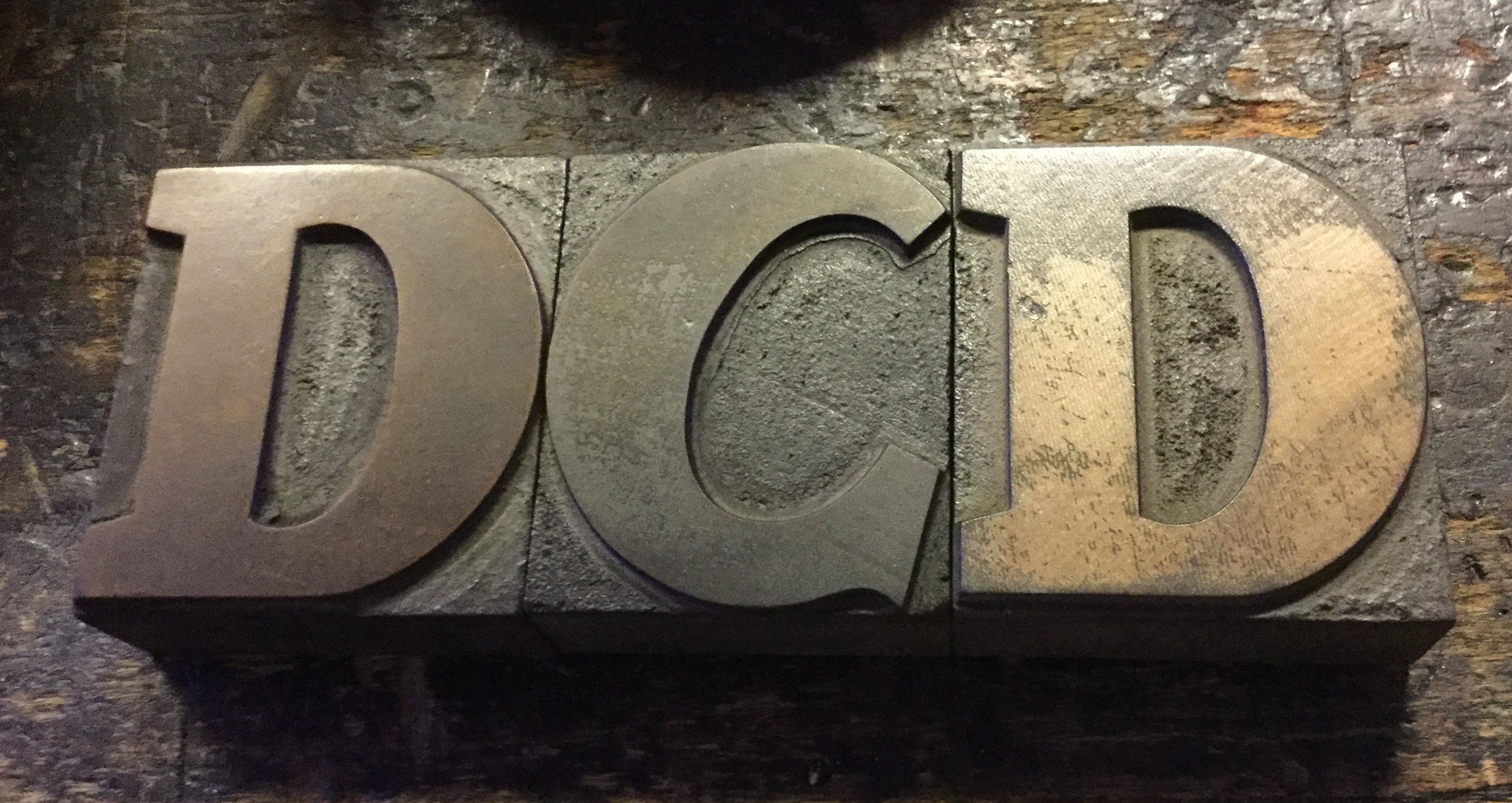
A small sample of the more than 270 characters which appear in Gutenberg's 42-line Bible.
The type Johannes Gutenberg used for his 42-line Bible looks very different from the type we see on our pages today. It is the first of a family of types alternately called Gothic or Blackletter which were initially intended (first by Gutenberg and then by other printers) to imitate the manuscript hand that had developed from the 13th to the 15th century that is sometimes called textura.
Textura hand has letters with ridges that "bite" into each other, and the letters and their ridges are spaced so closely together that they create the appearance of a black fence of text. This fence of text could be skillfully executed by scribes with pen and ink, but in order for Johannes Gutenberg to pull it off he needed a lot more than 23 lower case and 23 upper case letters. In fact, it is estimated that there were at least 270 different characters in Gutenberg's B42 type, an outrageous number considering that each type punch may have taken a whole day to carve.
What were all these extra type-pieces? Some of them were ligatures, which printed combined letters like do or si. It is speculated that some of these ligatures could have been produced in less time by using two punches to punch the same matrix, one punch on top of the other to form the ligature.
A large number of these additional characters, however, would have been determined by whether the letter precedes or is followed by a space, since in order to achieve the "fence" effect, Gutenberg had to have type-piece that looked like the end of one letter is attached to (or melting into) the next letter. Unlike today, where you can just have a graphics program overlay one image on top of another, Gutenberg needed to have specially cut characters that sat next to each other in his type forme to create the same illusion.